Government Art Collection

About the project
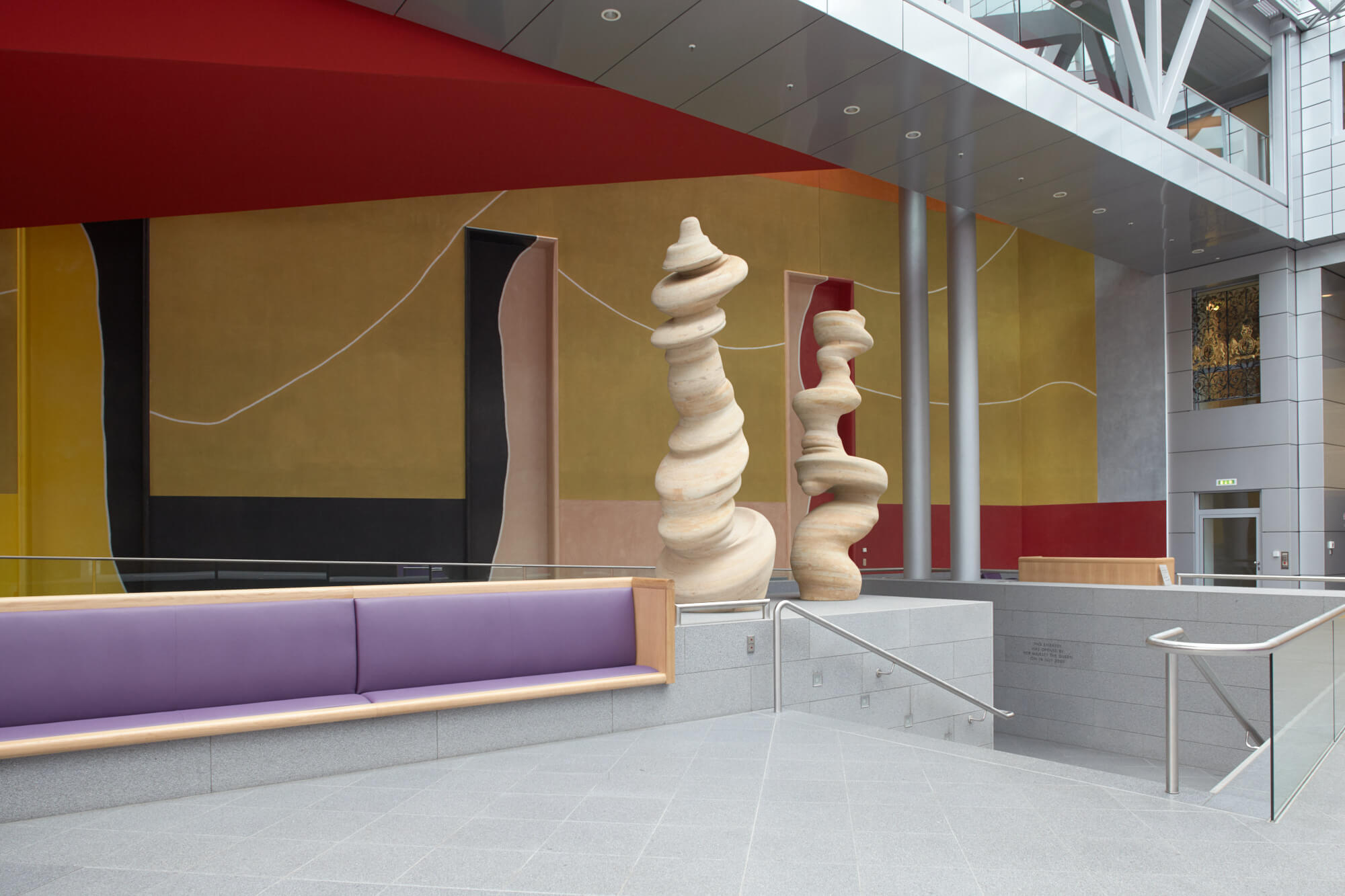
Works of art from the Government Art Collection are displayed in UK Government buildings in nearly every capital city, making it the most dispersed collection of British art in the world. The Collection plays a key role in British cultural diplomacy, delivering an expression of Britain’s soft power, its culture and its values.
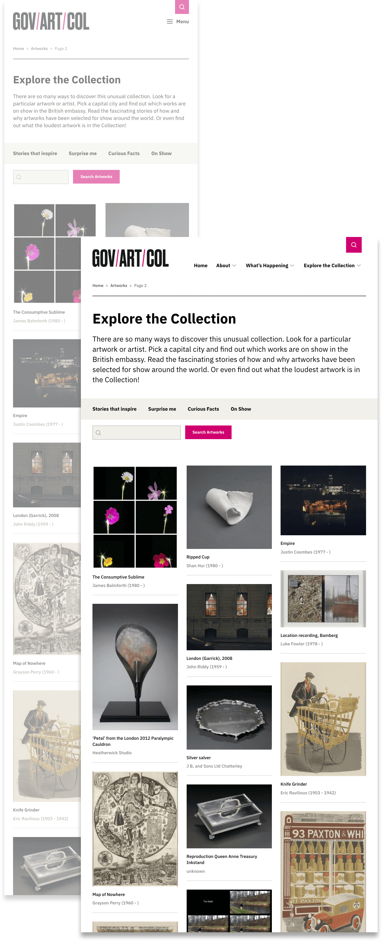
In developing a new website for the Collection, our key aims were to make it simple to locate a particular artwork within the 14,000+ items in the archive, and to provide an inspirational resource through which artworks suitable for particular diplomatic contexts could be surfaced.
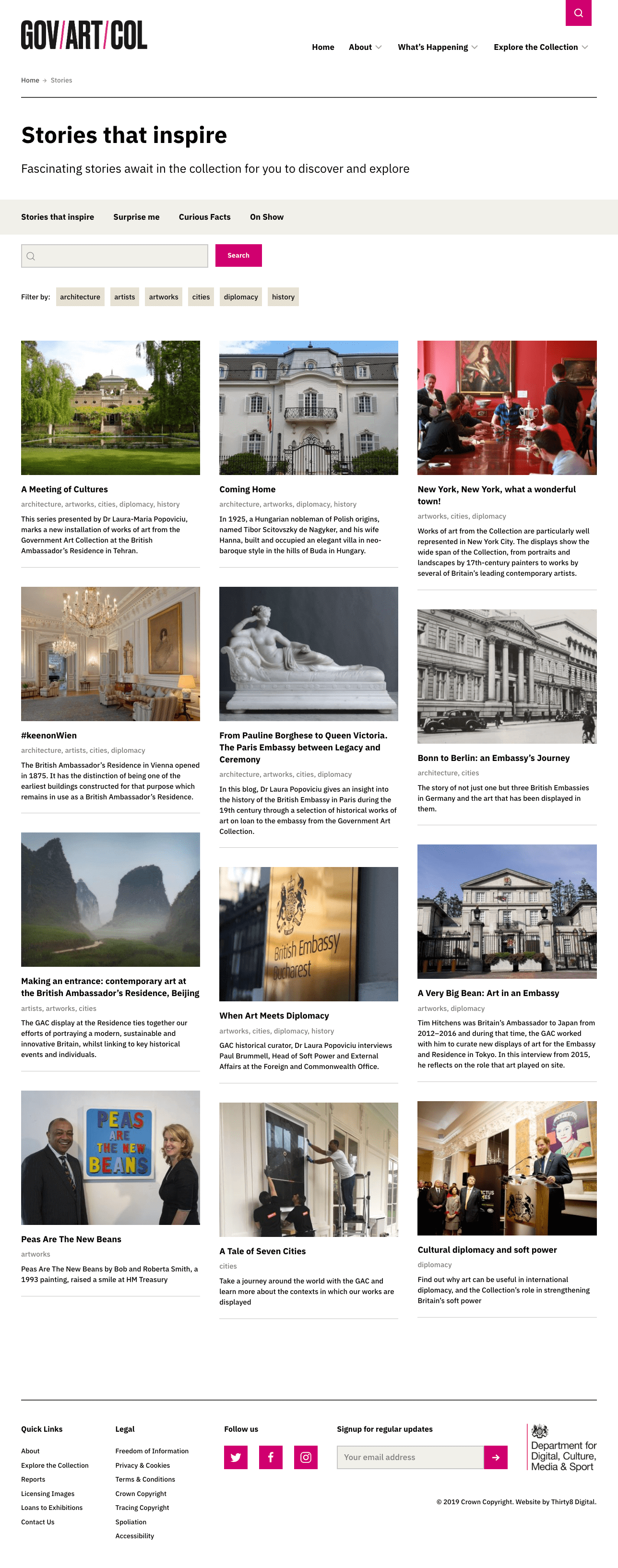
Finding new user routes into existing content through stories
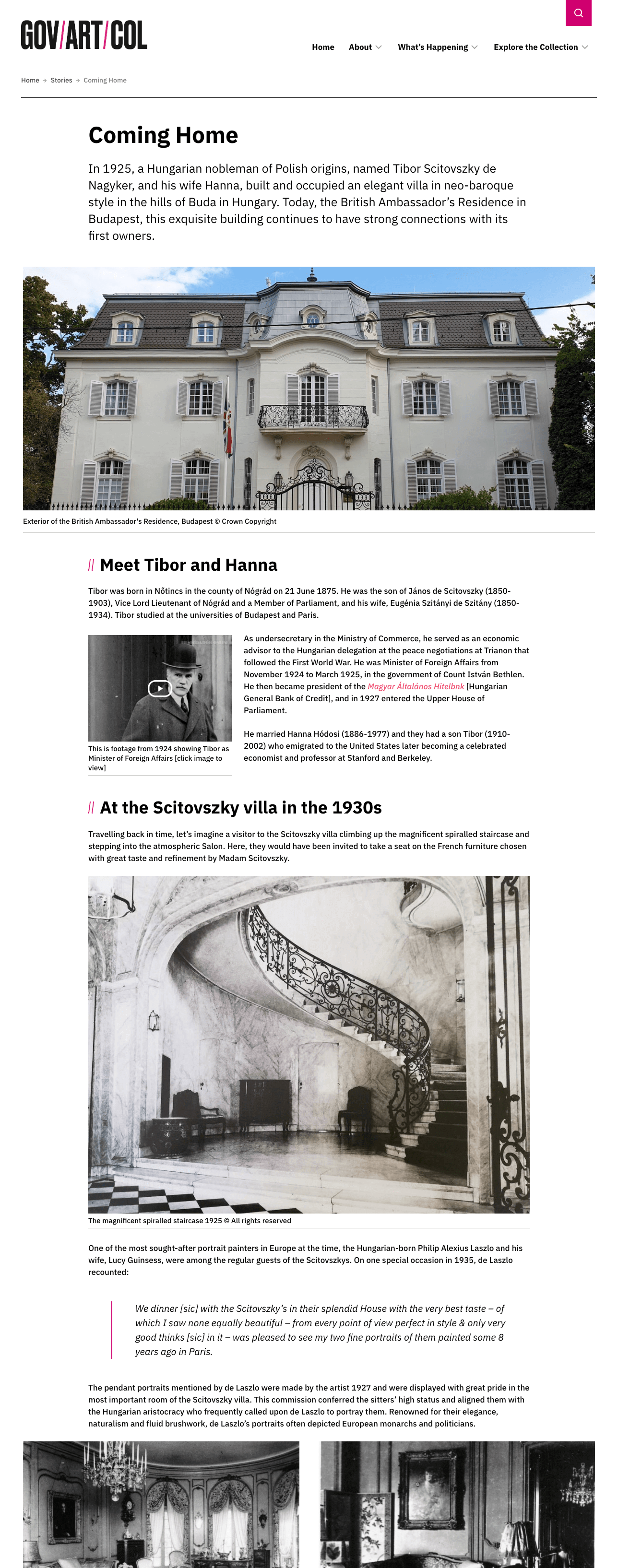
The Collection and it's artworks contain an abundance of stories, and this concept was used to present unusual and inspirational routes into discovering content. A number of compelling long-form Stories were created, then categorised and tagged for easy filtering. An individual Story can be composed from text, images, sound and video elements.
Designing for uncertainty
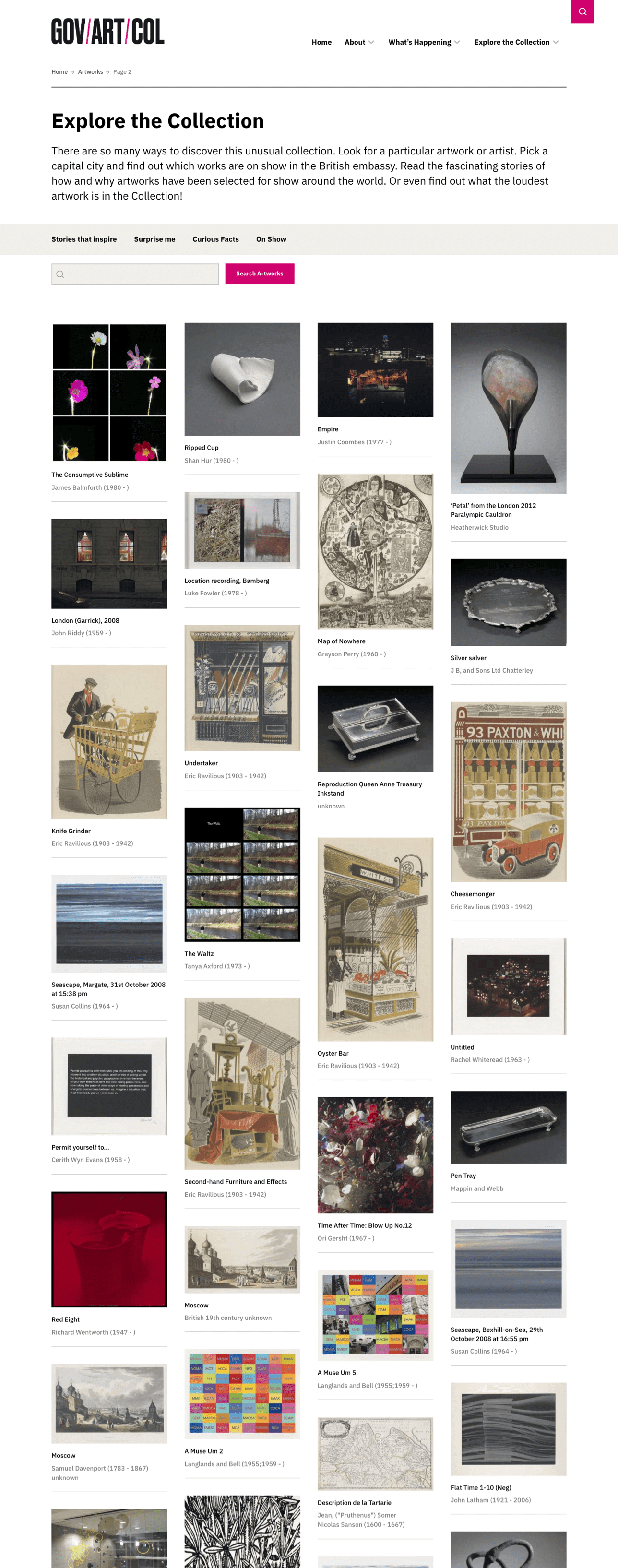
Presenting large amounts of artworks on screen within Collection index views posed an obvious challenge, in that user searches would return mixed sets of artworks of different dimensions and aspect ratios. Rather than try to shoehorn artworks into a strict grid, we opted for a more freeform masonry style layout for when numerous items would be on screen, and adapted the number of columns in the interface so collected artworks could be viewed comfortably on any device.
Keep it super simple
A striking identity of logo and primary brand colour was supplied as part of the project, and this helped in deciding to keep the interface as clear and light as possible. As many artworks of varying colour, tone and form could be displayed on any screen, it made sense to keep supporting design elements as neutral as possible, letting the images breathe and remain the main focus of users' attention.

IBM Plex Sans
A neutral, yet friendly Grotesque style with a comfortable amount of weights proved an perfect pairing to the displayed works (also search 'nobody ever got fired for choosing IBM' for why it's a solid choice).
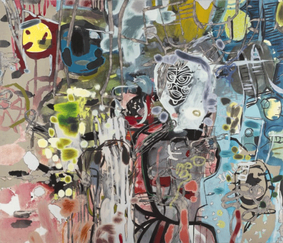
Masks
Dan Perfect, 2006
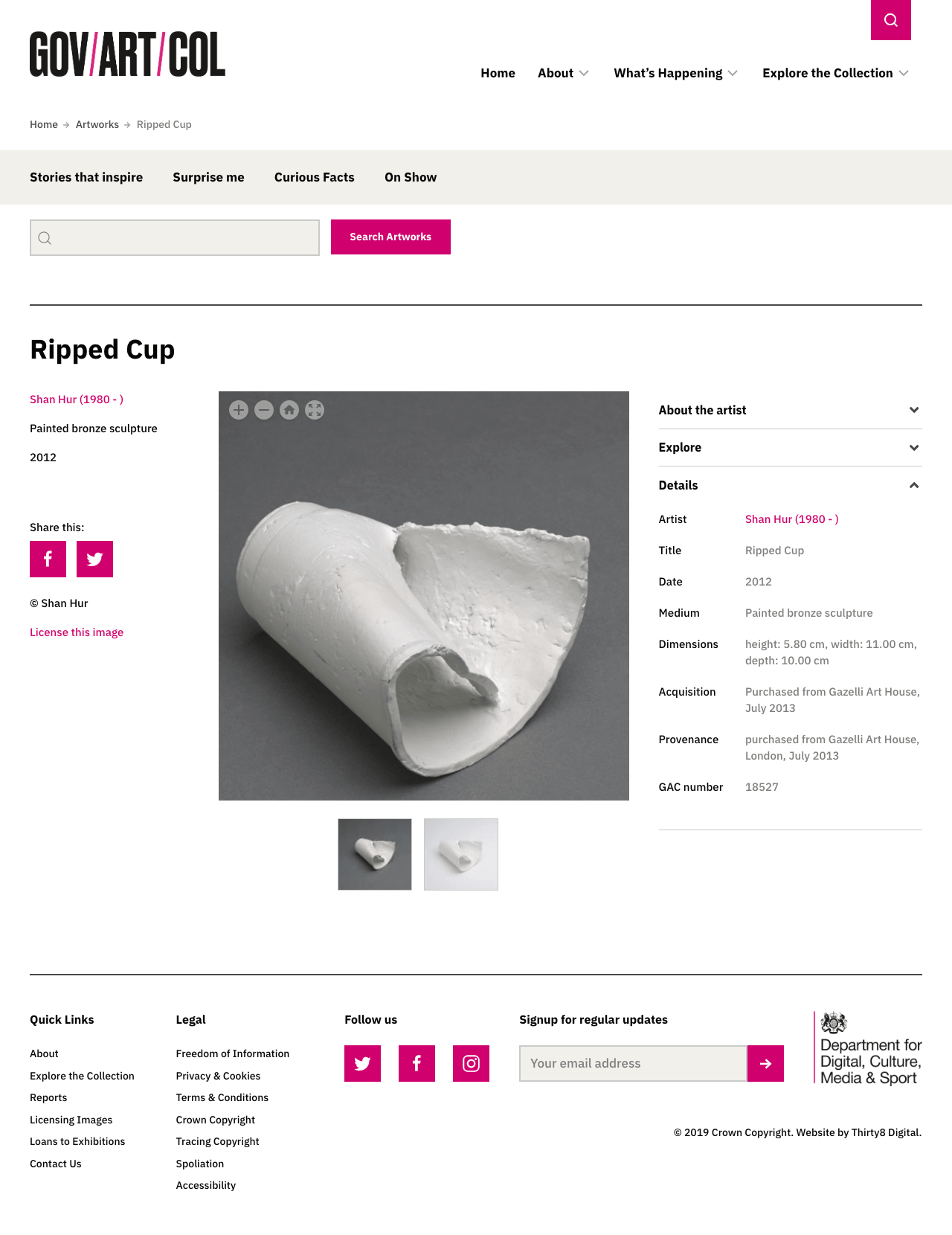
Dealing with high information density
Screens displaying single artworks posed another challenge, in that large amounts of information needed to be made available to the user, but ideally on an optional basis, so imagery could remain the focus.
An accordion UI element was used to fold away additional detail until required, and thumbnails were shown to indicate when alternate images were available. A zoom feature enabled both mouse and touch activated close-up viewing of works, and full-screen overlays were also made available for distraction free viewing, as in this example.
- UI Design + Front-end/WordPress Development
- Luke Burford
- Project Management + Strategy
- Thirty8 Digital
View Project https://artcollection.culture.gov.uk